The deadline for our annual book cover contest is November 17. At our December meeting, after David Kudler leads his presentation on cover design — you can register here — we will review the book cover contest submissions and vote on the best in each category. Below are instructions as well as a brief excerpt of David’s presentation that might guide you in adapting or choosing your cover submission.
Instructions:
-
- The contest is open to any book authored by a current BAIPA member, whether you worked with a designer on the cover or you designed it yourself. Any year of publication is fine. (Even next year, if the cover is finished.) You can submit a cover you’ve submitted before, unless you won. Only one entry per author.
- Fill out your contact information and genre and upload your cover here. Ideally at least 1000 pixels wide.
- Deadline is November 17, and you must be a current BAIPA member prior to that date as well. If you are not yet a member, please go here and take advantage of our special offer of $50 for six months, with automatic renewal.
- We will put the covers together into slides that we’ll display at the meeting and then we’ll use a Zoom poll and everyone present will get three votes. We will also share the slides in advance of the meeting, via a blog post like this one, so you’ll have a chance to percolate on your choice.
(Last year, we grouped the books into: (a) nonfiction, (b) memoir, (c) mystery & thriller, (d) children’s, and (e) general fiction, historical fiction, and poetry. This year’s categories will be determined by the volume of submissions in each category.)
Winners get a free workshop in 2024.
The 3 Promises a Cover Makes
Before you submit your cover, I’d like to share an excerpt of David’s presentation, which he calls the “The 3 Promises a Cover Makes” — genre, tone, and subject matter. These promises will be among the criteria that your cover will be judged — by BAIPA members at the December meeting as well as potential readers at a bookstore or online retailer.
Genre
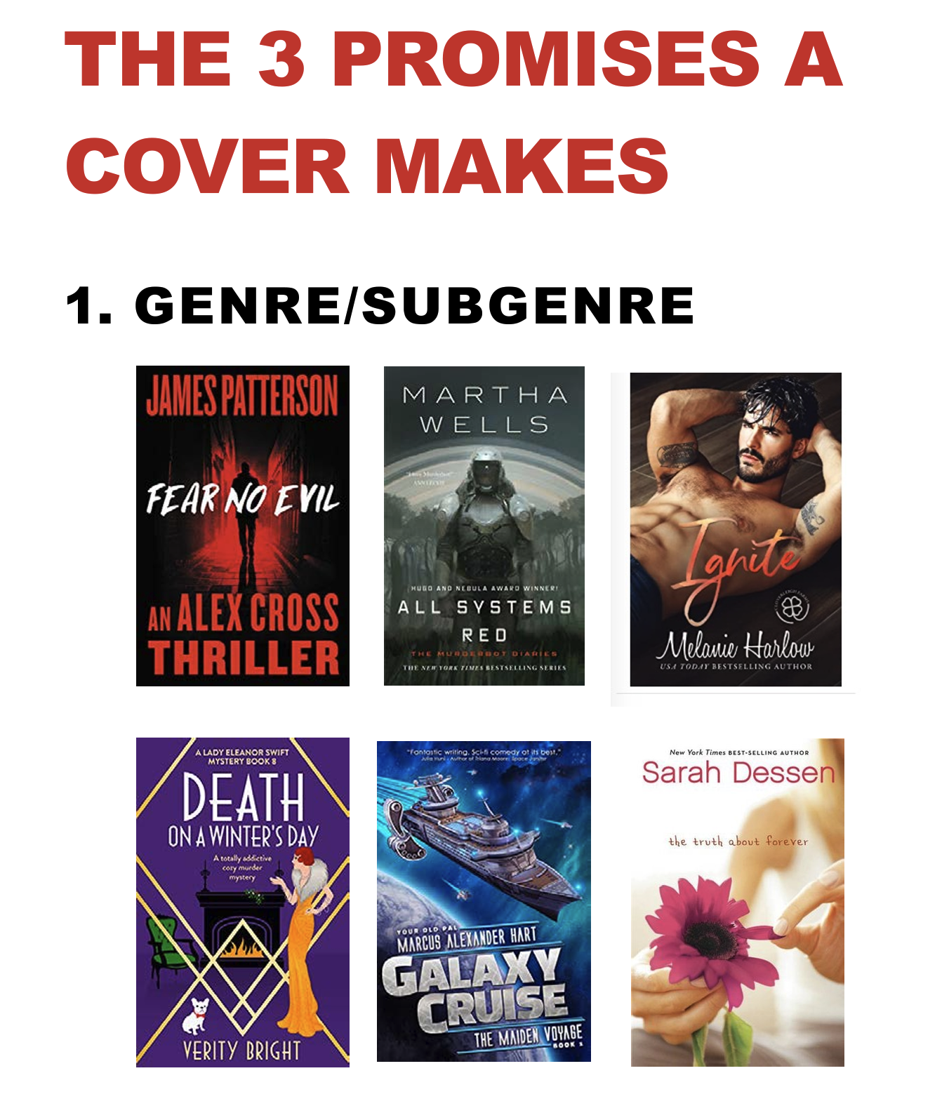
First is genre. At a glance, you should be able to tell what the genre of the book is, without having to think very hard.
In the image below, there’s no mistaking James Patterson’s genre. It not only looks like a thriller with its fiery red and black color scheme, it says thriller in big bold letters.
All Systems Red is not as blatant, but the image of the character in the space suit/armor signals science fiction pretty clearly.
And a sexy and/or scantilly clad man (or woman) is widely recognized signal of a romance.
Covers can also telegraph subgenres, like Death on a Winter’s Day, which is a cozy mystery, with its fireplace and fur-bedecked woman and her lap dog. As opposed to a hard-boiled detective mystery, which is more likely to include a gun or menacing man shrouded in darkness.

Tone
Tone is trickier, but also something a potential reader should be able to grasp in a quick moment. Is your book scary? Funny? Dark and violent?
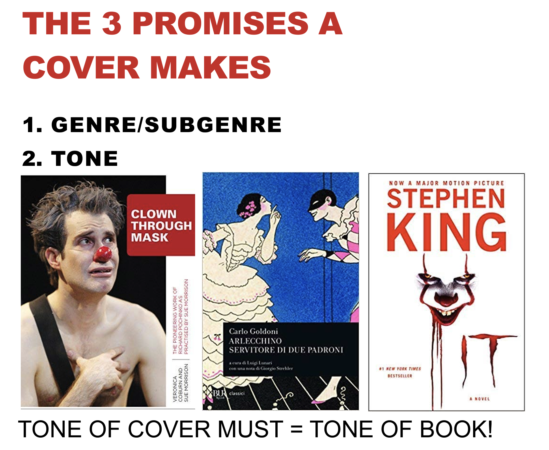
Though tone can overlap with genre, books in the same genre can have wildly different tones.
For example, below are three books about clowns.
The first is a serious academic treatise. Not funny at all. The second is a romantic comedy. The third, by Stephen King, may feature a clown, but it’s horror, not comedy.
The main thing to remember here is the tone of the cover needs to reflect the tone of the book.

Subject Matter
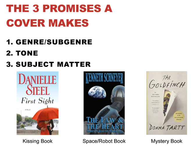
What the book is about also overlaps with genre and tone, and can be challenging to depict, but important in attracting readers. You need not be literal about the subject — you don’t need, for example, to show a scene from the book — but you do want to communicate what the book is about.
The Danielle Steel book is not just a romance, but a kissing book. About these two paramours under the umbrella. The Law & the Heart is a space/robot book. The Goldfinch is a literary mystery.

There’s also a fourth promise, but you’ll have to participate in the December meeting to find out what it is.
We look forward to seeing your covers. Here’s the submission form.