On September 21, I’ll be part of a local author panel at the Mill Valley Library called “Writing California,” about researching and writing books set in the state. (See flyer and link below.) Since I’ll be talking about Wasted, my “green-noir” mystery set in the Berkeley garbage and recycling universe, I am once again percolating on whether or not to redesign its cover
Wasted is the first novel I wrote — it took more than ten years — and I sometimes think of it as a “lesser” work than my other two novels. (It sold fewer copies and garnered fewer reviews than my other two novels, though I read it again recently and was thrilled with how entertaining it is and how well it captures the zeitgeist of Berkeley, from its recycling movement to its contradictions to its high self-regard.)
But the cover is a problem.
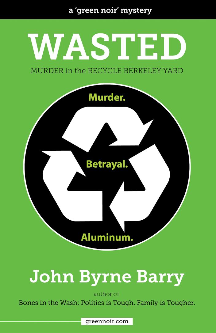
Set in the gritty and malodorous world of garbage and recycling, Wasted explores rich and resonant themes of reinvention, transition, and discarding that which no longer serves us.
Berkeley reporter Brian Hunter investigates the “recycling wars,” finds the body of his friend Doug crushed in an aluminum bale, and hunts down the murderer, all the while trying to win the heart of Barb, Doug’s former lover, now a suspect in his murder.
Part mystery, part love triangle, and part political satire, Wasted asks the age-old question: How do I act with truth and integrity, make the world a better place, and still get laid?
I designed the cover — I’ve been a graphic designer for decades — and I was happy with it, at first. I thought it was crisp and clean and memorable.
So much so I entered it in Joel Friedlander’s monthly ebook cover design contest on thebookdesigner.com.
Here’s his critique:
This is a very common situation in which a skilled graphic designer brings those skills into book cover design, which is much more tied to conventions.
Obviously the designer is skillful, but the big fail is that the book looks like nonfiction or a corporate publication, and has no trace of what must be the excitement and drama in the story.
Ouch!
As any BAIPA member who’s learned about cover design from David Kudler — he’ll be doing his annual cover design presentation again this December — the main job of the cover is to tell potential readers what kind of book it is.
Well, Wasted is not a corporate publication or a recycling textbook, so I failed on that front.
Over the years, I’ve tried other designs, but haven’t been happy with any of them.
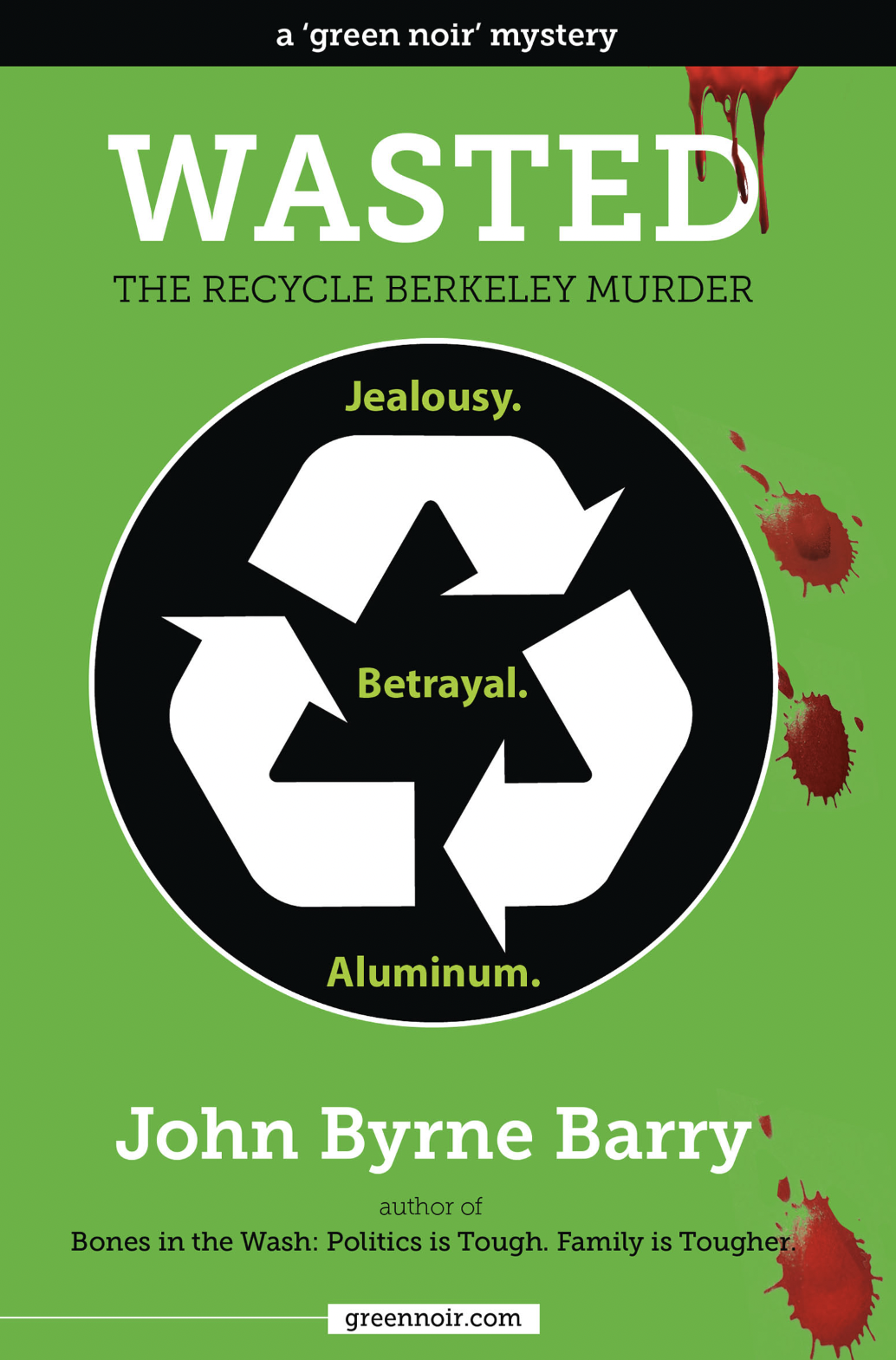
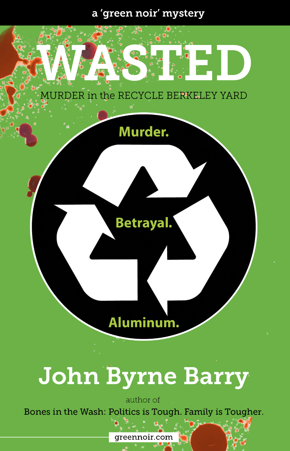
First, I added blood. Better? At first I thought so, but I was not convinced enough to upload the new cover to KDP.
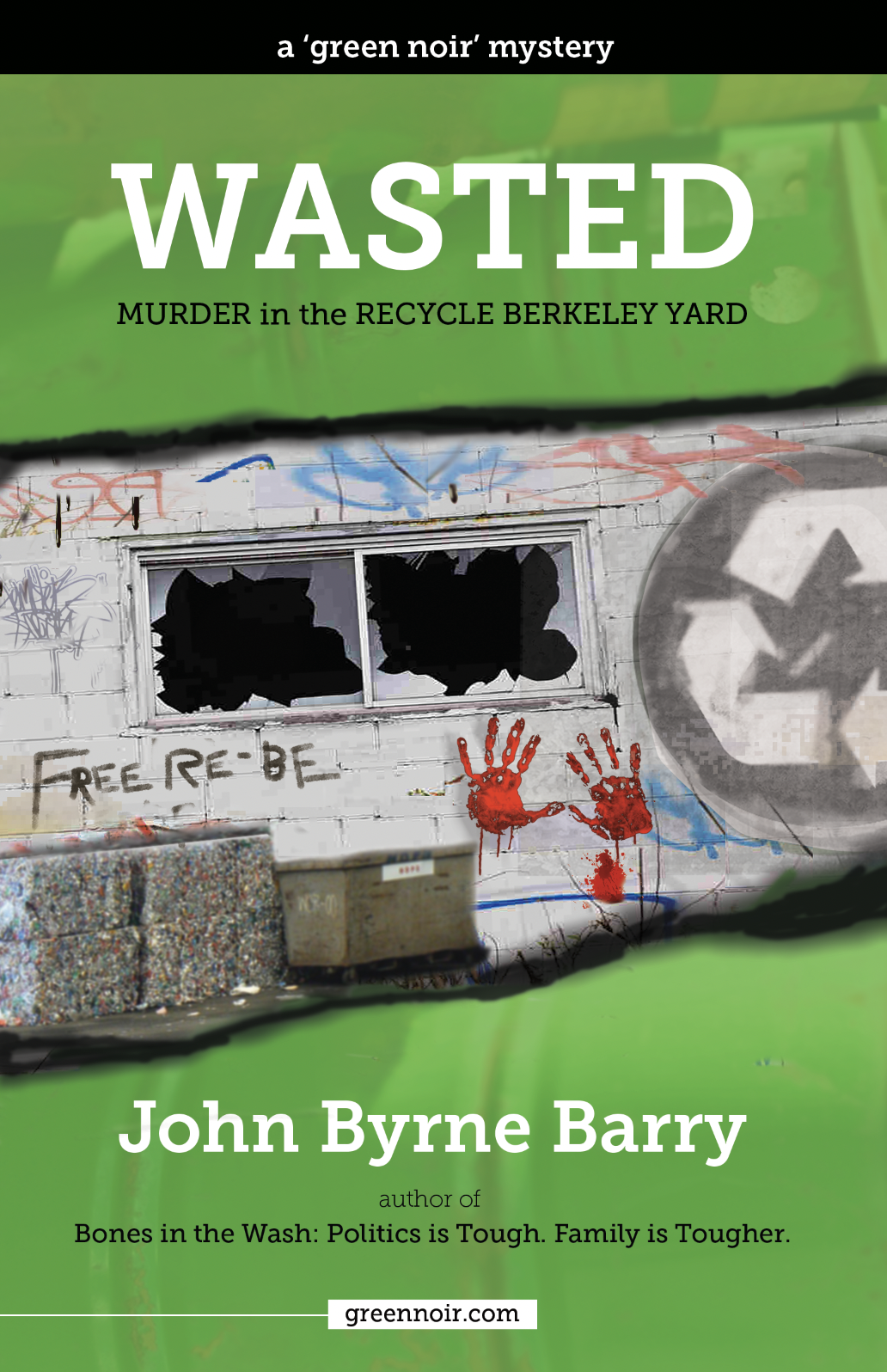
Then I tried the industrial warehouse look. Busy and ugly. Not an improvement. And not even good at telegraphing what kind of book it is.
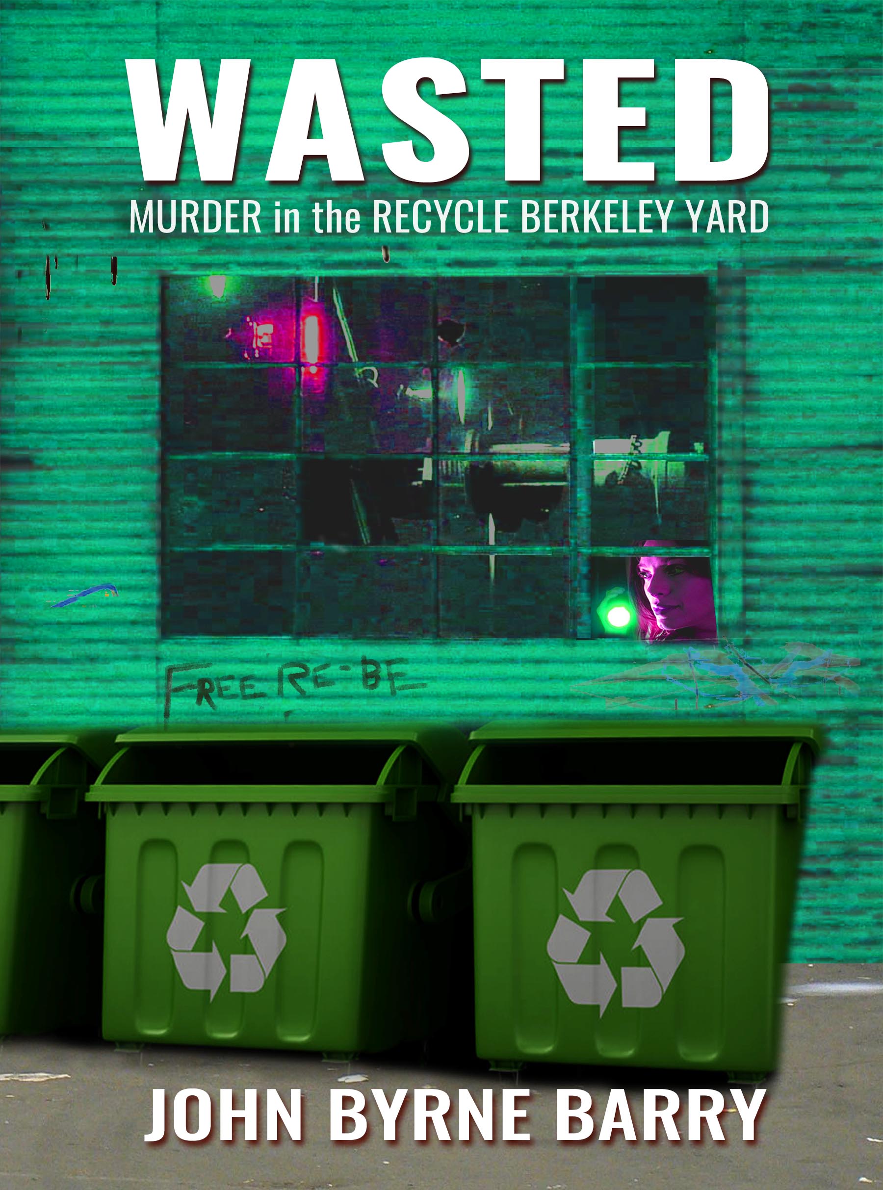
And more recently, because I wanted to order more copies to sell at the upcoming panel discussion, I tried to go back to the original, with the recycling arrows, but also with a hint of suspense. Specifically, a woman with a flashlight. I also integrated a corrugated metal warehouse into the background.
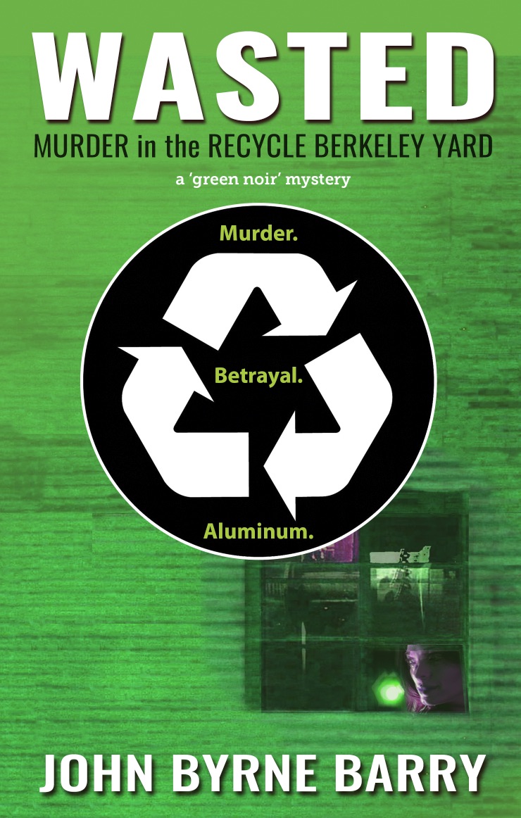
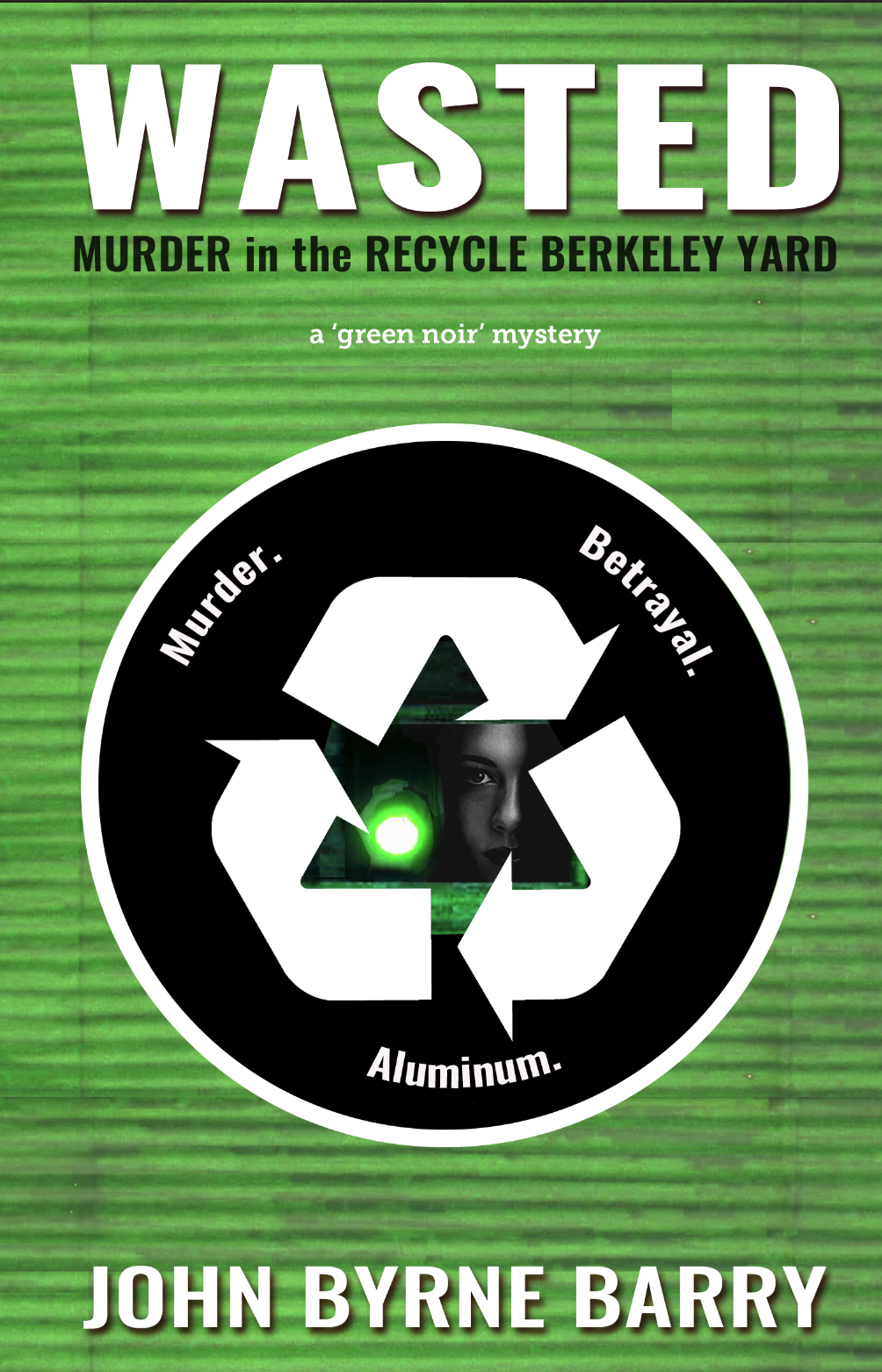
I’m leaning toward the one on the right, with the woman with the flashlight in the center.
I welcome your input.
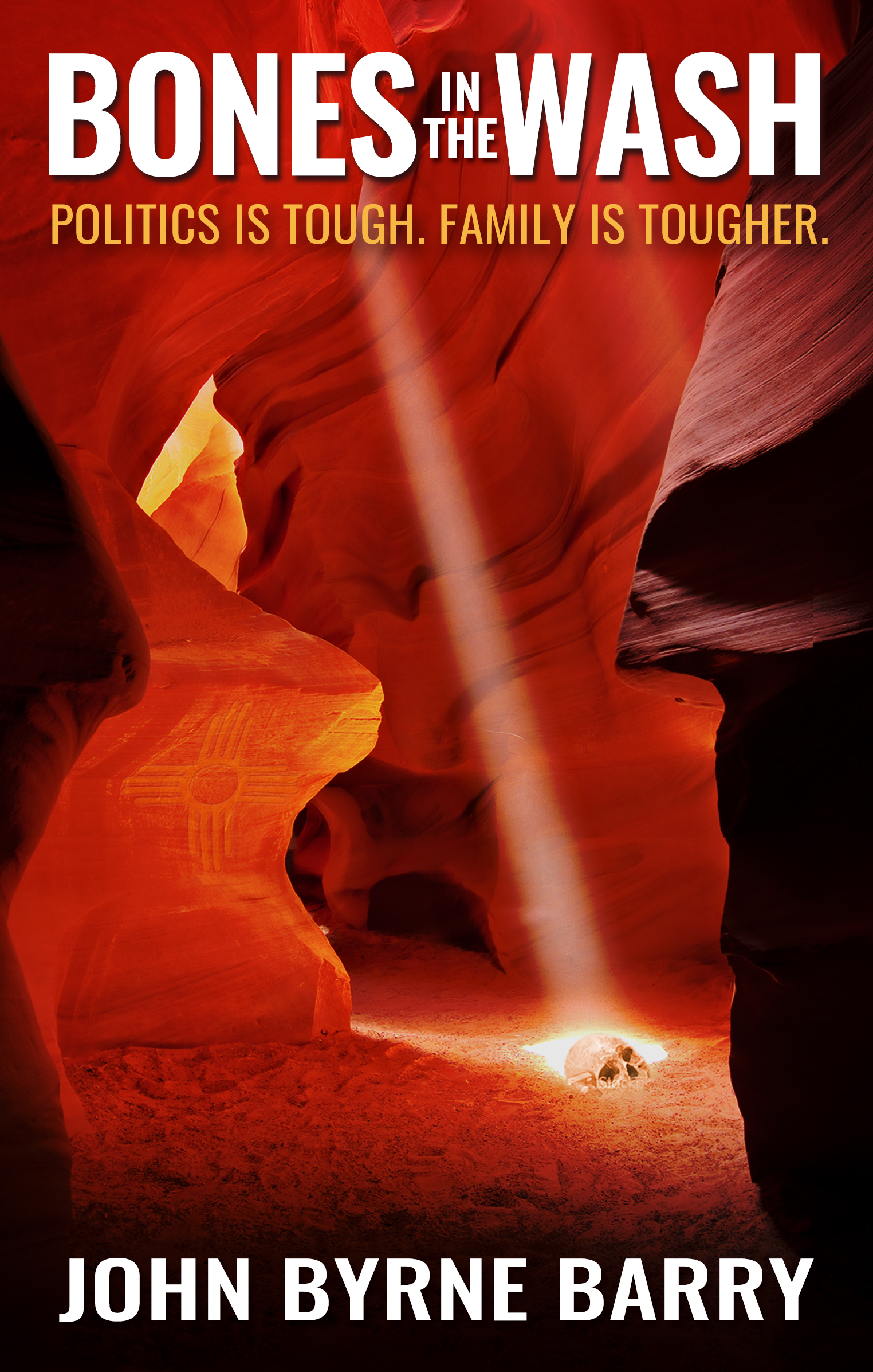
One last thing, which David Kudler inspired me to do at his presentation last December. Even though my books are not a series, I like the idea of them being branded in a similar way. Which is why, in these last two designs above, I changed the type to be more like Bones in the Wash.
 .
. 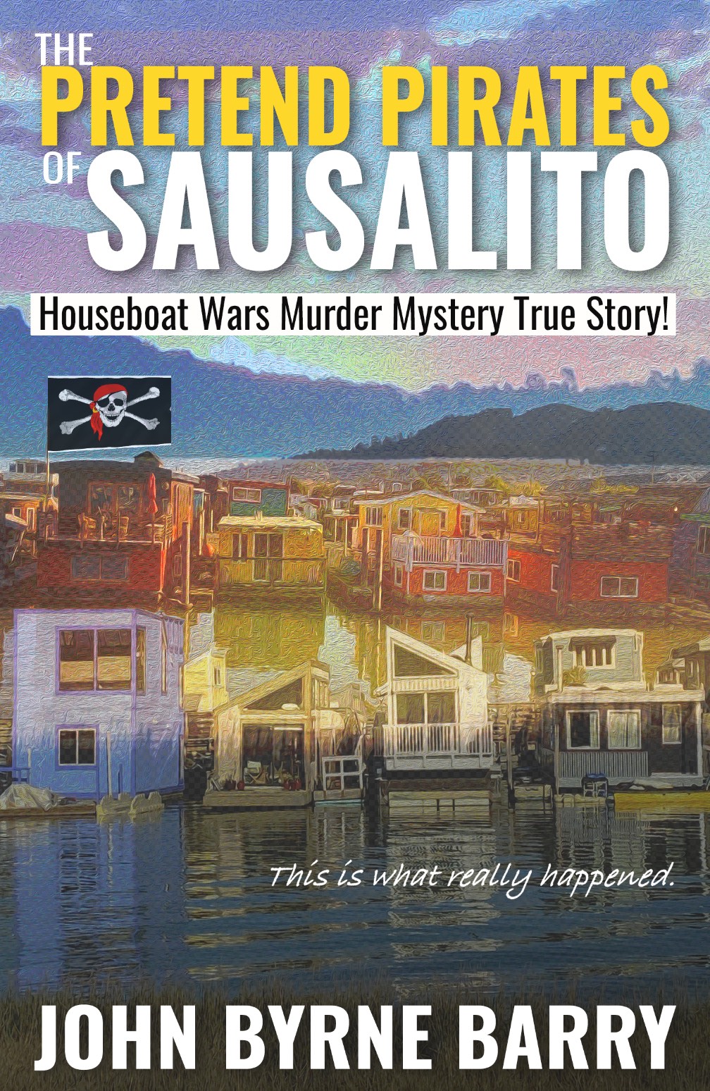
So here are Wasted, Bones, and my novel-in-progress — the color, the words, and imagery are different, but the layout and typeface are unified. And I may be able to unify then more.
UPDATE: At this morning’s BAIPA meeting, I shared the covers above as part of “Five-Minute Feedback,” and was shocked by the consensus of the group. During the discussion, many people liked the cover I referred to as “ugly,” with the broken windows and bloody hands. But I hadn’t even included it in my final four for the poll. Becky added as it choice E, and it “won” 70 percent of the vote.

Wow. What an eye-opener. I was so sure the last cover, the woman with the flashlight inside the recycling arrows, would get the most votes. (It got 17 percent.) But that’s because I couldn’t let go of the recycling arrows. Based on the discussion and the poll, one reason the “ugly” choice may have won is because it did not have the recycling arrows, except in a much less prominent way.
Thank you so much, BAIPA members, for your feedback.
I’m going to sit with this for a few days before I do anything, and I welcome any additional feedback in the comments or via email — [email protected].
I love designing book covers. But geez, it is hard!
P.S. Here is the flyer for the “Writing California” panel discussion at the Mill Valley Library, where I’ll be talking about Wasted, among other things. The event is free. Hope to see you there. Register here.